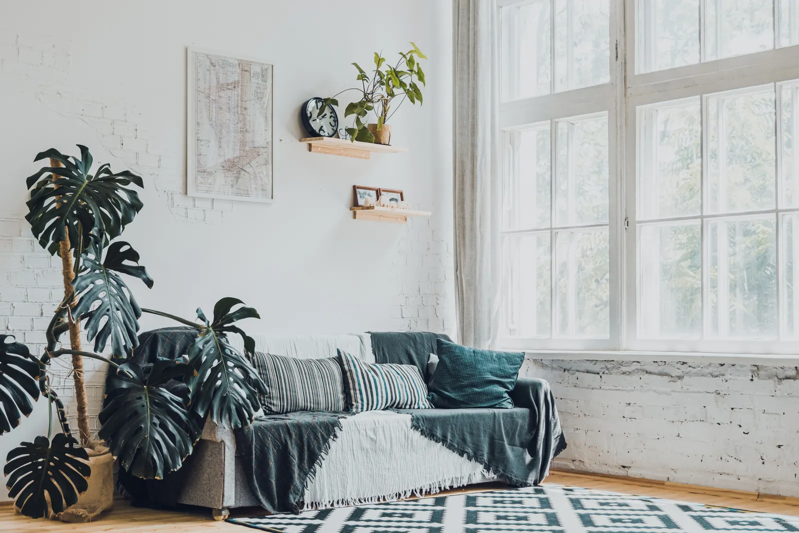
Scandinavian Calm: Light Wood, White Walls, and Texture
Published
Scandinavian calm comes from balancing pale materials and useful forms with enough texture, shadow and warmth to make a room feel lived in. Keep what works, then adjust the surfaces, lighting and proportions: a wool throw, a lower-glare bulb, or a rug that joins the seating can change the feeling without replacing the furniture.
Start with materials, not a white-paint rule
Light oak, ash and birch bring different notes to a restrained room. Oak tends to read warmer and more golden; ash can look pale with a visible grain; birch often has a softer, less contrasty surface. These woods work with white walls, but also with warm gray, muted green or a chalky beige. The goal is a calm relationship between surfaces, not a room in which every finish matches.
The TextielMuseum’s Simply Scandinavian exhibition and the Design Museum Denmark’s collections offer useful reminders that Scandinavian design is a wide field of objects and ideas, not one prescribed palette. For a practical starting point, keep existing wood and upholstery, then choose one wall or textile color that relates to them. The sample palette below is a set of adaptable working colors, not a claim about a single traditional scheme.
- Warm chalk
#F1EEE6 - Pale ash
#D5C8B4 - Soft sage
#A8B2A0 - Ink accent
#343A39 - Muted clay
#B8795F
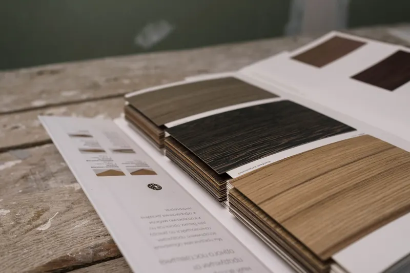
Use texture to give pale rooms depth
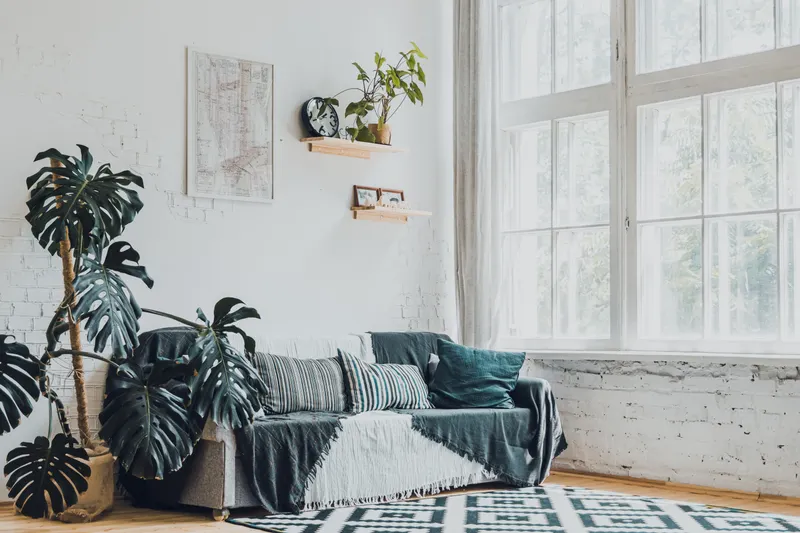
A room can stay light without making every surface smooth. Pair a flat painted wall with a nubby wool cushion, a linen curtain, a woven basket or a matte ceramic lamp base. Let materials differ in both touch and reflectivity: a low-sheen tabletop beside a glazed vase, or a loosely woven throw against a tightly upholstered sofa. Two or three distinct textures in one seating area are usually more legible than many small decorative objects.
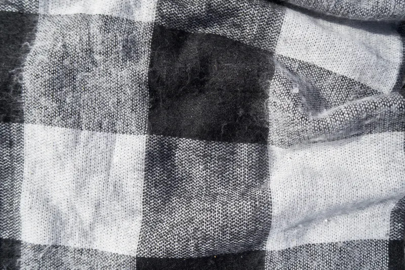
Look for texture at different scales. A fine linen weave can sit beside the broader loops of a wool throw; a basket can add a stronger pattern without introducing another color. Leave some plain surface visible, especially on shelves and coffee tables. The useful contrast is between tactile objects and quiet space, not between a bare room and a crowded display. ArchDaily’s discussion of Scandinavian interiors emphasizes the connection between design, function and material choices; that is a helpful test for each addition: does it serve a use as well as add surface interest?
Layer light at three working heights
A single ceiling fixture can flatten an otherwise thoughtful room. Combine general light with a reading light and a lower, softer source. As a starting point, place a table lamp with its top about 100–125 cm (39–49 in) from the floor when it sits on a 50–60 cm (20–24 in) side table. Check it from the chair: the shade should direct light onto the reading area without putting the bulb in your direct line of sight. A floor lamp beside a chair can do the same job if its shade is adjustable.
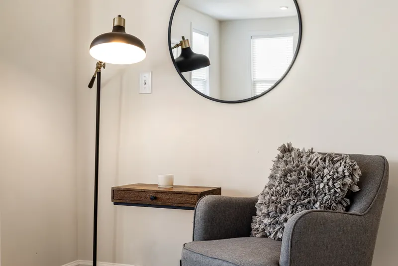
Over a dining table, begin with the bottom of a pendant about 70–85 cm (28–33 in) above the tabletop, then adjust for the fixture’s size and the seated view across the table. Use a dimmer where compatible, or choose bulbs with a warm-looking color temperature so evening light does not turn pale walls icy. Treat these measurements as a first fit, not a rule: sit down, check glare, and make sure the fixture does not obstruct conversation or the view through the room.
- General light: ceiling fixture or broad indirect source, controlled separately if possible.
- Task light: reading lamp beside the chair, with the shade aimed at the page rather than the eyes.
- Low light: table lamp on a sideboard or console to create a softer pool after dark.
Anchor the seating with a correctly sized rug
A rug gives the seating group a clear footprint and adds a large area of texture. Measure the sofa and the distance between its front edge and the chairs before choosing one. A rug that is too small can make furniture look scattered; a larger one can connect separate pieces. IKEA’s rug size guide is a useful visual reference for comparing rug footprints with room layouts. Use the following scheme as a starting point, then check it against door swings, walkways and the size of the actual furniture.
- Compact seating group: 160 × 230 cm (63 × 91 in), with the coffee table centered and the rug extending under the front feet of the sofa if the layout allows.
- Roomier group: 200 × 300 cm (79 × 118 in), with the front legs of the sofa and chairs on the rug so the seating reads as one zone.
- Large open plan: size the rug to the seating area rather than the whole room; leave a visible border of floor around the group and keep the main walkway clear.
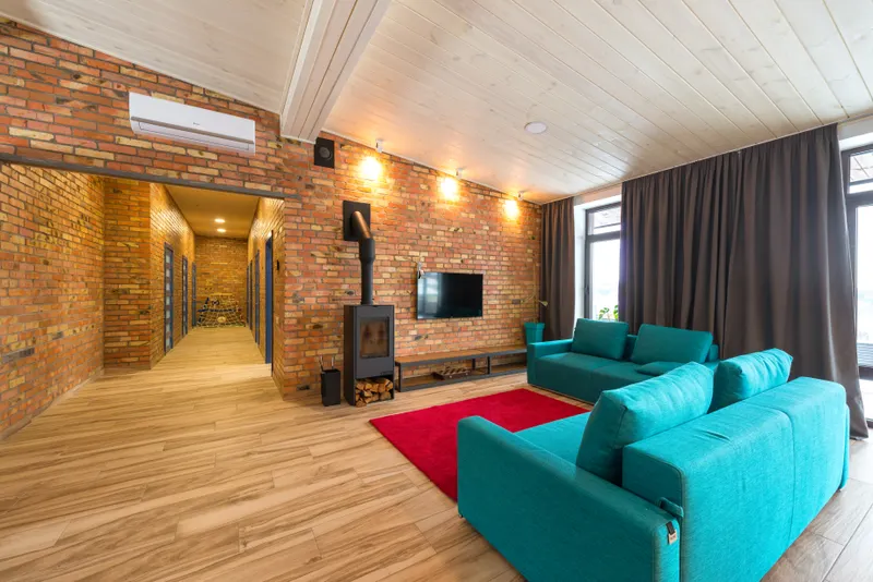
Before ordering or moving a rug, tape its proposed outline on the floor with painter’s tape. Walk the routes you use every day and pull out each chair if the rug will sit beneath a dining table. This simple full-size test is more reliable than judging a rug from a small sample or a product photograph. For an existing rug, try turning it or shifting the seating before concluding that it is the wrong size.
Add contrast and greenery with a light hand
Pale wood and light walls need a little visual weight. Repeat a dark accent two or three times across the room: perhaps a charcoal lamp stem, a black picture frame and a dark bowl. Repetition makes the contrast feel intentional; a single isolated dark object can look accidental. Soft green leaves can add another quiet contrast, but a plant is not essential to the style. Use one with a shape that suits the available light and place it where it will not block a window, radiator or walking route.
Make changes in a small sequence so it is easy to see what helps. First remove objects that have no clear use or place. Next, add one soft texture where a person sits, then test a lamp at its actual height. Finish by checking the room from the doorway and from a seated position. A wide phone photo can reveal whether pale surfaces have become a blank field, whether a dark accent is stranded, or whether the rug stops short of the furniture it should connect.
For another reference point, compare Scandinavian furniture and decor at a Portuguese furniture retailer, using its mix of furniture, textiles and accessories as a source of ideas rather than a shopping list.
Questions
- Can Scandinavian-inspired rooms use color?
- Yes. Keep the palette controlled rather than limiting it to white: muted green, warm beige, soft blue or clay can work with pale wood. Repeat a chosen color in a textile or small object so it feels connected to the room.
- What if the room already has dark wood furniture?
- Keep the furniture and lighten the elements around it. Try a pale rug, linen curtains or a warm wall color, and use one or two dark details elsewhere to make the wood feel deliberate rather than isolated.
- How can I make a rental room feel warmer without painting?
- Use removable changes first: a textured rug, curtains, cushions, a table lamp and a few framed prints. Choose warm-toned bulbs and avoid relying on a bright ceiling fixture alone.
- Do all the wood finishes need to match?
- No. Keep the undertones reasonably compatible and vary the grain or finish. For example, pale ash can sit beside warmer oak if a textile or wall color helps bridge the two.
 Frame 1