Gallery Walls & Display

Most photographs spend their lives on a phone. This section is about the ones that make it onto a wall, and about giving them a setting that does them justice.
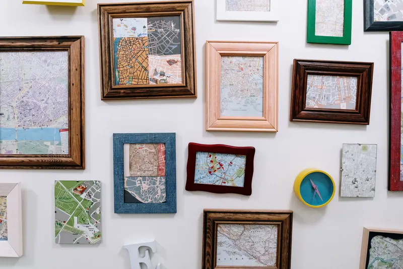
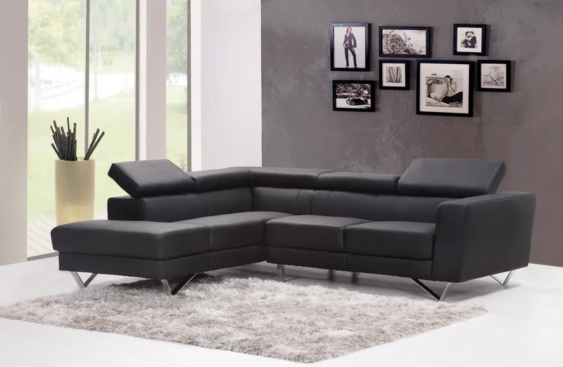
A gallery wall looks effortless when the decisions behind it are deliberate: the height of the center line, the gap between frames, the width of a mat, the relationship between a grouping and the sofa or sideboard beneath it. Those decisions come down to a handful of numbers, and we give them in both centimeters and inches, with layouts you can trace on paper before you pick up a hammer.
Beyond layout, we look at the choices that change how a print feels in a room: paper finishes and what they do to color, mixing black-and-white with color prints, picture ledges against hung frames, and lighting artwork without glare or fading. The aim is a wall that looks intentional from the doorway and still rewards a closer look.
Every guide cites the framers, paper makers, museums and conservation sources behind its advice, so the numbers are not just a matter of taste.