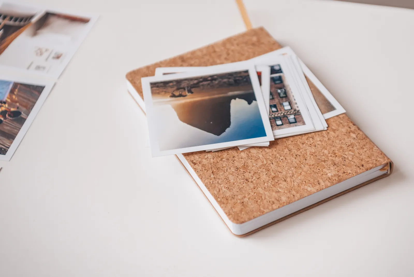
Photography Blog Design: Headers, Backgrounds, and Type
Published
A photography blog lets its photographs lead when the header gives the images room, the background stays quiet, and the type is easy to scan. Start with a restrained palette, a clear header crop, and one or two typefaces; then check how photographs fit on a wide screen and a phone. The dimensions below are practical starting points, not platform rules.
Set a header that behaves like a frame
Choose the header shape to suit the job it performs. A compact masthead with a title and small wordmark can begin at 1440 × 240 px, with 140–200 px of visible height. A full-bleed photographic header can start at 1800 × 520 px, with 300–420 px visible on desktop. For an image with text over it, keep the important part of the photograph inside a central safe area about 1000 × 240 px; crops at the edges are easier to lose on phones.
Set the site’s content width separately from the background image. A full-width header can span the screen while the title, navigation, and article text sit in a centered 1100–1280 px column. For a more magazine-like, narrow reading layout, use 760–840 px for article text. The UK Government’s Page structure: Layout and typography guidance is a useful reference for arranging content with clear, consistent hierarchy.
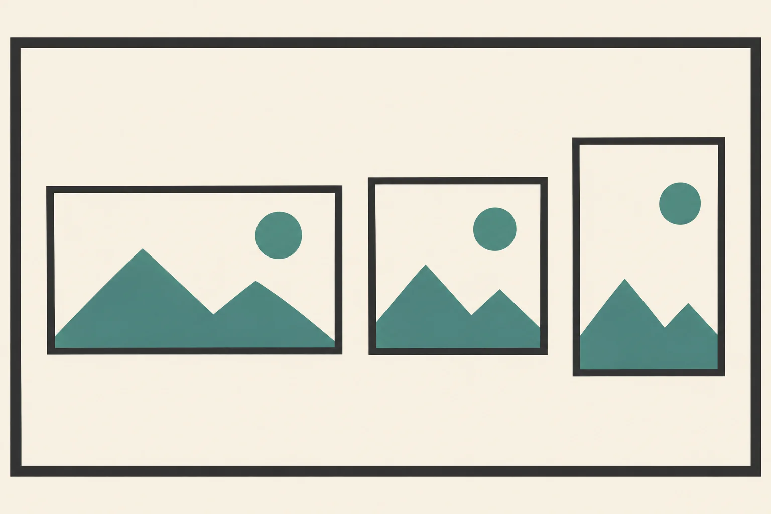
- Wide photographic masthead: prepare a 1800 × 520 px source; keep faces, horizons, and key details away from the outer edges.
- Compact title masthead: prepare a 1440 × 240 px background, then let the site title sit on a solid or lightly textured field.
- Text over an image: use a 2000 × 700 px source and place title text over a quiet central area, not across the most detailed part of the photograph.
Build the page around a quiet neutral
Use one background color across most of the page and reserve stronger color for links or small details. This warm, low-contrast-in-feel palette keeps the page from pulling attention away from photographs while retaining clear text contrast. Copy the hex values as written; the accent is for small decorative marks, not body text.
- Paper background
#F6F3ED - Main text
#252421 - Link teal
#285C56 - Fine rule
#D8D2C8 - Terracotta accent
#B66A4E
Set paragraphs in #252421 on #F6F3ED; the contrast is approximately 14:1. The link teal, #285C56, reaches approximately 6.8:1 against the same background. Underline links so readers can identify them without relying on color alone. Use #D8D2C8 for separators and #B66A4E for a small icon or label, not for small text. If you want a printed color reference, set the swatches on A4 paper at 21 × 29.7 cm (8.3 × 11.7 in), with 1.5 cm (0.6 in) margins.
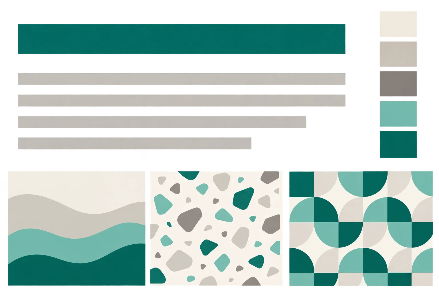
Download 1 — Ivory grain: a 2400 × 900 px background with fine, even paper texture. Use it behind a compact masthead or as a quiet strip above a light page.
Download 2 — Soft rule: a 2400 × 900 px warm-white field with very faint horizontal lines. It adds texture without imitating a photograph; keep text on an unlined area.
Download 3 — Pale sand: a 2400 × 900 px flat, gently shifting neutral background. It works behind a short title or wordmark. These are generated screen backgrounds, not photographs of rooms; use the palette hex codes for matching the rest of the page.
Choose type that stays out of the way
Use one typeface for both headings and body copy if it has enough weights; otherwise pair one serif heading face with a plain sans serif for paragraphs. Keep the pairing consistent rather than giving every category its own font. A practical starting scale is 16–18 px for body text, 30–40 px for the page title, and 22–28 px for article headings. Set body line spacing around 1.5 times the text size, and avoid long lines: a 760–840 px article column usually gives photographs and paragraphs distinct roles.
For example, pair Georgia for headings with Arial for body copy, or choose one readable sans serif throughout. Check lowercase letters and numerals at phone size, and use bold weight sparingly so it signals hierarchy rather than competing with the images. Canada’s Typography tokens page shows how a defined type scale can create consistent levels of emphasis. Keep navigation short and use the same casing and spacing for each item.
Size photographs for two reading distances
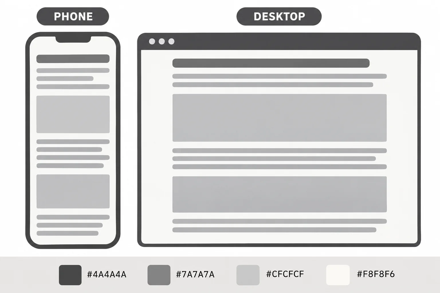
On desktop, set article photographs to the full width of the text column, typically 760–840 px, and let occasional feature images stretch to 1100–1280 px. Keep portrait photographs within the same column instead of enlarging them until their edges dominate the page. For a phone viewport around 390 px wide, leave 20–24 px of space at each side; the image then has roughly 342–350 px to fill. Test both a landscape and a portrait image, since their crops reveal different problems.
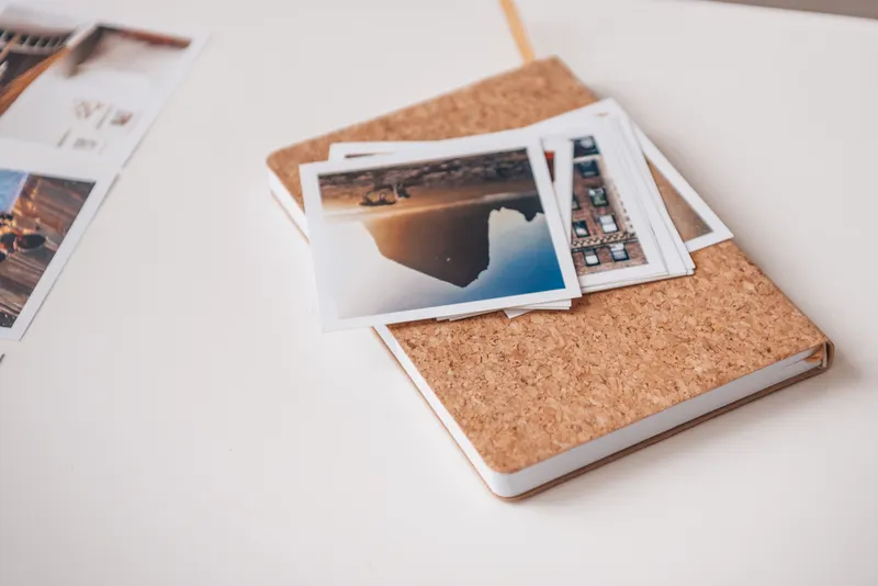
Prepare a source image wider than its largest display size; around 1600–2400 px is a useful working range for a full-width feature image. Check that the subject remains visible when the image scales down, and avoid placing titles over detailed areas. Google’s Image SEO best practices emphasizes descriptive alt text and placing images in relevant page context. Write alt text for what is actually visible, not for keywords: “Three small prints arranged in a row on a pale tabletop” is more useful than “photography blog design.”
Restyle the header in one afternoon
Make the changes in a controlled order so it is easy to spot what improved. Save a copy of the current header image and note the existing type sizes and colors before replacing them. Then apply the new choices in this sequence:
- Set the page background to #F6F3ED and body text to #252421. Change link color to #285C56, and make links visibly underlined.
- Choose either a compact or full-bleed header size from the dimensions above. Crop the image around its focal point, then check the title at desktop and phone widths.
- Set the content column to about 760–840 px for articles. Make photographs fill that column, with feature images extending only when the composition supports it.
- Choose one typeface or a two-face pairing. Apply the same title, heading, and paragraph sizes throughout the site.
- Open a long article and a short one on a phone. Check that the title wraps cleanly, navigation remains legible, and the first photograph appears without a narrow sliver or awkward crop.
Treat the background texture as optional: if it makes a photograph feel busier, switch to the flat paper color. A strong header system should still look deliberate when its image is removed, and a strong photograph should remain the first thing the eye notices.
Download the files
Free for personal and commercial use. These files are generated artwork, not photographs.



Questions
- Should a photography blog use a logo in the header?
- A small wordmark can help identify the site, but it does not need a separate image if the site title is set clearly in type. Keep the mark modest and leave the photographs as the strongest visual element.
- Which file type should I use for a downloadable background?
- Use PNG for a flat field or crisp repeating pattern, and JPEG for subtle grain or other continuous texture. If your publishing platform accepts another format, check the saved file at full size before replacing the current background.
- How can I keep a header image from cropping badly on phones?
- Keep the subject and any text-safe space near the center, then preview the header at a narrow phone width. If the crop still removes the main subject, use a separate mobile crop or switch to a simpler background.
- Can the palette be used for a printed mood board?
- Yes. The listed hex values are useful for a digital reference, but printed color can vary with paper and printer settings. Print swatches as a visual guide and compare paint or paper samples in their intended light.
 Frame 1