Warm Neutral Colors from Screen to Paper and Paint
Published
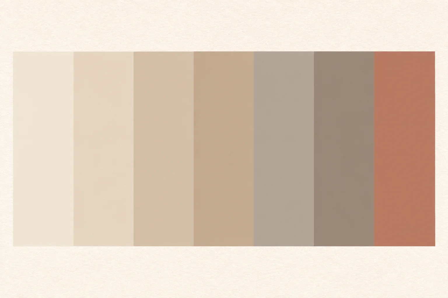
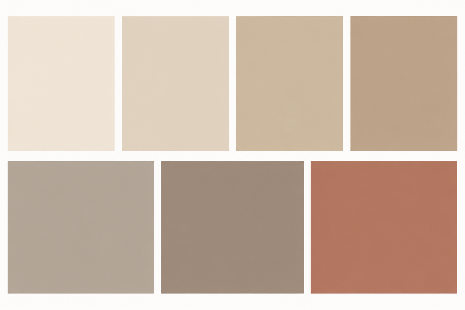
A useful warm-neutral palette for portraits and rooms starts with cream, oatmeal, warm greige, and soft clay, then keeps each shade muted enough to work beside real skin and textured walls. The seven colors below are starting points, not universal matches: light, neighboring colors, screens, paper, and paint finishes all change how they appear.
Seven warm neutrals, from cream to clay
The palette moves from a pale, slightly peachy cream to a deeper clay. Its undertones lean yellow, red, or brown rather than blue, so the colors sit comfortably beside warm wood, linen, and many skin tones. The gentler differences in value also make it possible to layer the shades without creating a sharp, high-contrast effect. Use the hex values as digital starting points; they describe screen colors, not guaranteed paint matches.
- Soft cream
#F2E8D8 - Warm ivory
#E7D8C5 - Oatmeal
#D4C1A7 - Sandstone
#C5AD91 - Warm greige
#B5A89A - Mushroom
#9F8D7D - Soft clay
#B97962
In plain text, the set is Soft cream #F2E8D8, Warm ivory #E7D8C5, Oatmeal #D4C1A7, Sandstone #C5AD91, Warm greige #B5A89A, Mushroom #9F8D7D, and Soft clay #B97962. Keep the names and codes together in a palette file so the intended color is easy to identify later. The shades are intentionally related, but not interchangeable: Soft cream is the lightest background; Mushroom and Soft clay carry more visual weight.
Why warmth can help in portraits
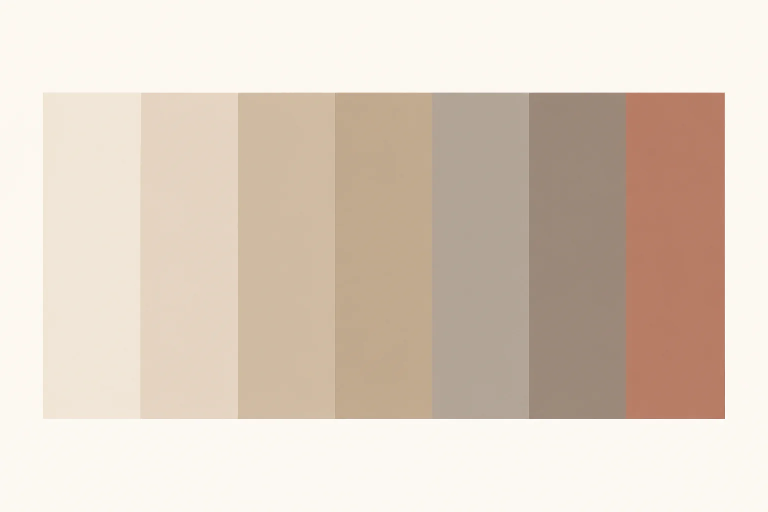
A softly warm background can make a portrait feel less stark than a cool white one. It can also bounce a little colored light back toward a nearby subject, especially when the backdrop is large, matte, and close. That reflected light may read as warmth in shadows or along the edge of a face. The same effect can become an unwanted yellow or orange cast, however, and it will vary with the subject’s skin, the light source, the backdrop’s distance, and camera white balance. No single neutral flatters every person or lighting setup.
For a simple test, place the background at least 90 cm (36 in) behind the subject, then photograph the same framing against Soft cream, Oatmeal, and Warm greige. Keep the light and camera position fixed, and compare the files on the same calibrated or consistently set display. A gray card can help set a repeatable white balance; Cambridge in Colour’s guides to white balance and color management explain why camera settings and display handling affect the result. If a shade seems too warm, try moving it farther from the subject before changing the light or editing the image.
Test the colors against plaster and room light
On a wall, texture and illumination matter as much as the color name. Uneven plaster catches light differently across ridges and shallow hollows, while a smooth sample board gives a cleaner first comparison. Paint a board at least 45 × 60 cm (18 × 24 in), let it dry fully, and view it upright beside the wall. A tiny chip is difficult to judge because the surrounding wall color can visually influence it.
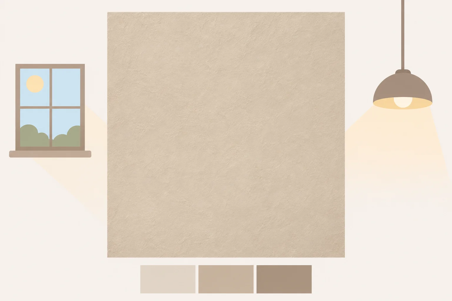
Look at the sample near the window during the day and again under the room’s usual lamps. Warm evening light can make cream and clay seem more orange; a cooler window or nearby blue-green object can make the same paint look grayer by comparison. Check it beside the floor, trim, and the largest piece of furniture rather than in isolation. If the palette feels too sweet, use Warm greige or Mushroom for a larger area and reserve Soft cream for trim, a ceiling, or a small bright surface. If it feels dull, try the clay shade on a modest surface before committing to a whole wall.
Expect a shift from screen to print to paint
Hex values are RGB instructions for displays. Different screens can show them differently because brightness, color settings, and display profiles vary. A screen set very bright may make Soft cream look nearly white; a screen with a cooler appearance may push Oatmeal toward gray. The International Color Consortium describes profiles as a way to characterize how devices reproduce color. In practice, a profile-managed workflow can improve consistency, but it cannot make unlike devices produce identical results.
Print introduces its own materials. Ink sits on paper with a particular white point, surface, and absorbency, so the same design can look warmer on cream stock and cooler on bright white stock. If the printer workflow supports it, use the profile for the specific printer and paper. Otherwise, print a small test strip with all seven colors before producing an invitation or mood board. For a useful paper comparison, print the strip on both a warm-white and a bright-white sheet, then view them in the light where the finished piece will be used.
Paint is not a direct translation of a hex code. The screen value is only a reference for discussing hue and lightness; paint formulas, sheen, surface texture, and room illumination affect the result. Bring the hex list as a visual guide, then compare physical paint samples in place. A matte finish tends to show less glare than a glossier one, but the wall’s texture and light still matter. Treat the physical sample as the decision point, not a screen preview.
Choose one accent and use the download files
Pair the neutrals with one accent rather than adding several competing colors. A muted blue-green such as #5F7770 gives the warm creams and clay a cooler counterpoint. Use it on a single repeated detail—a narrow rule in a layout, the ribbon on an invitation, or one cushion beside a warm wall. For photography, place a small blue-green object in the frame only if it belongs in the scene; otherwise, keep the background neutral and let the subject remain the strongest color. The accent is an optional companion, not an eighth neutral in the palette.
Two generated files accompany the palette. The swatch sheet is a flat PNG at 3000 × 2000 px; at 300 ppi, that is about 25.4 × 16.9 cm (10 × 6.7 in). It is arranged as simple color blocks for reference and print tests. The background is a lightly textured PNG at 3600 × 2400 px, or about 30.5 × 20.3 cm (12 × 8 in) at 300 ppi, suited to a screen header or a small print. Both are generated graphics, not photographs of painted rooms. Texture can make individual pixels vary, so use the listed hex codes when you need a precise flat color.
- Use the swatch sheet to compare the seven colors on your own screen or paper.
- For paint, take the printed codes as references and judge a large physical sample in the room.
- For a photo backdrop, check the background in the actual shooting light and watch for color spill onto skin.
Download the files
Free for personal and commercial use. These files are generated artwork, not photographs.

Questions
- Can a hex code be converted directly into a paint formula?
- No. It can help communicate a color direction, but a screen value does not specify a paint formula or account for finish, texture, or room light. Compare physical samples in the intended space.
- Should the portrait background match the subject’s skin undertone?
- Not necessarily. A close match can reduce separation, while a slightly different warm neutral may create a gentler contrast. Test more than one shade with the same light and camera settings.
- Why does a printed swatch look different from the PNG?
- Displays emit light, while printed ink is viewed through reflected light from paper. Display settings, printer and paper profiles, ink, and the paper’s own color can all affect the result.
- Can the textured background provide an exact color sample?
- No. Texture creates small variations across the image. Use the palette’s plain hex values for exact digital swatches and treat the textured file as a background.