Linen, Plaster and Paper: Six Subtle Textures to Download
Published
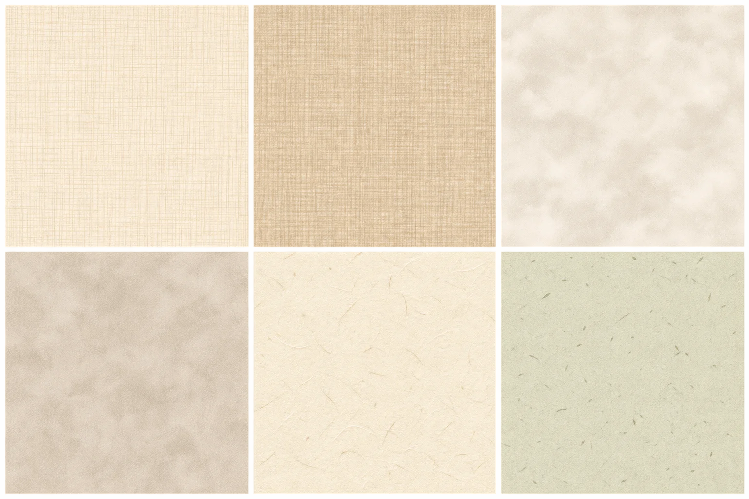
Use these six generated textures as quiet backgrounds for blog headers, invitations, photo overlays and mood boards. The set takes its cues from linen, lime plaster and handmade paper, but each file is an abstract digital surface—not a photograph or a scan of a real material. Every texture has a base hex color, plus guidance for placing text over it and preparing a usable crop for screen or print.
What these textures are—and are not
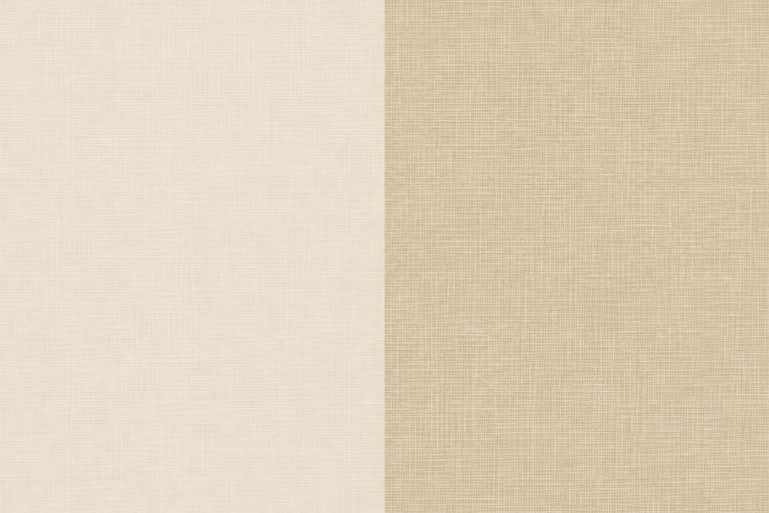
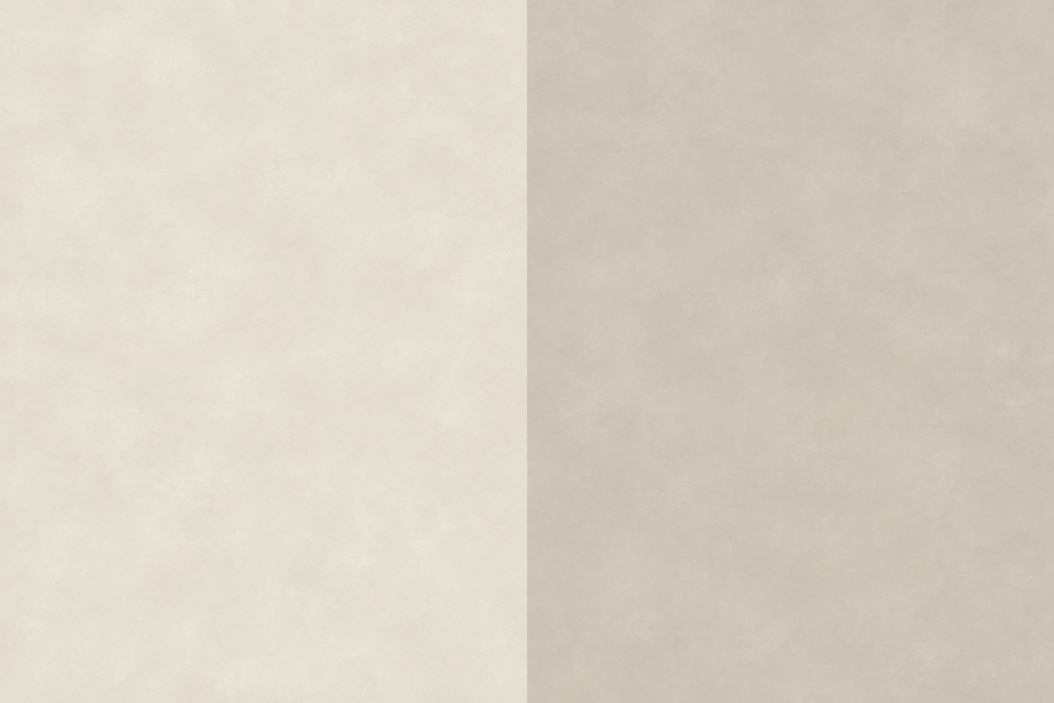
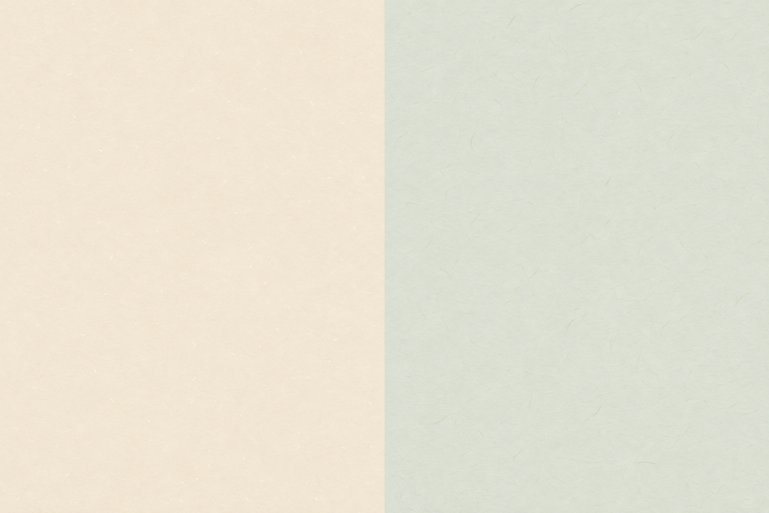
A texture background combines a flat ground color with restrained, irregular marks. These six are designed to add a little surface variation without making a layout feel busy: the linen-inspired versions have fine crossing threads, the plaster references use cloudy tonal shifts, and the paper-like ones have faint fibers and soft flecks. The descriptions identify the visual cue, not a claim about the material.
The files are generated graphics, not photographs of linen cloth, plaster walls or handmade sheets. That distinction matters when you choose a texture: a photographic surface can include lighting, shadows, seams or perspective that compete with your design. These backgrounds are deliberately flatter and more even, so they can sit behind copy, a photograph or a small arrangement of swatches. Linen is a flax fiber; the first two textures borrow its woven visual character rather than depicting actual fibers.
Treat the images as starting surfaces, not finished layouts. Add your own type and images in a design tool, and adjust the crop to fit the space. If you need a truly seamless repeating pattern, check the edges before using a texture as a tile; these files are intended as backgrounds and crops, not guaranteed repeat patterns.
Six surfaces and their base colors
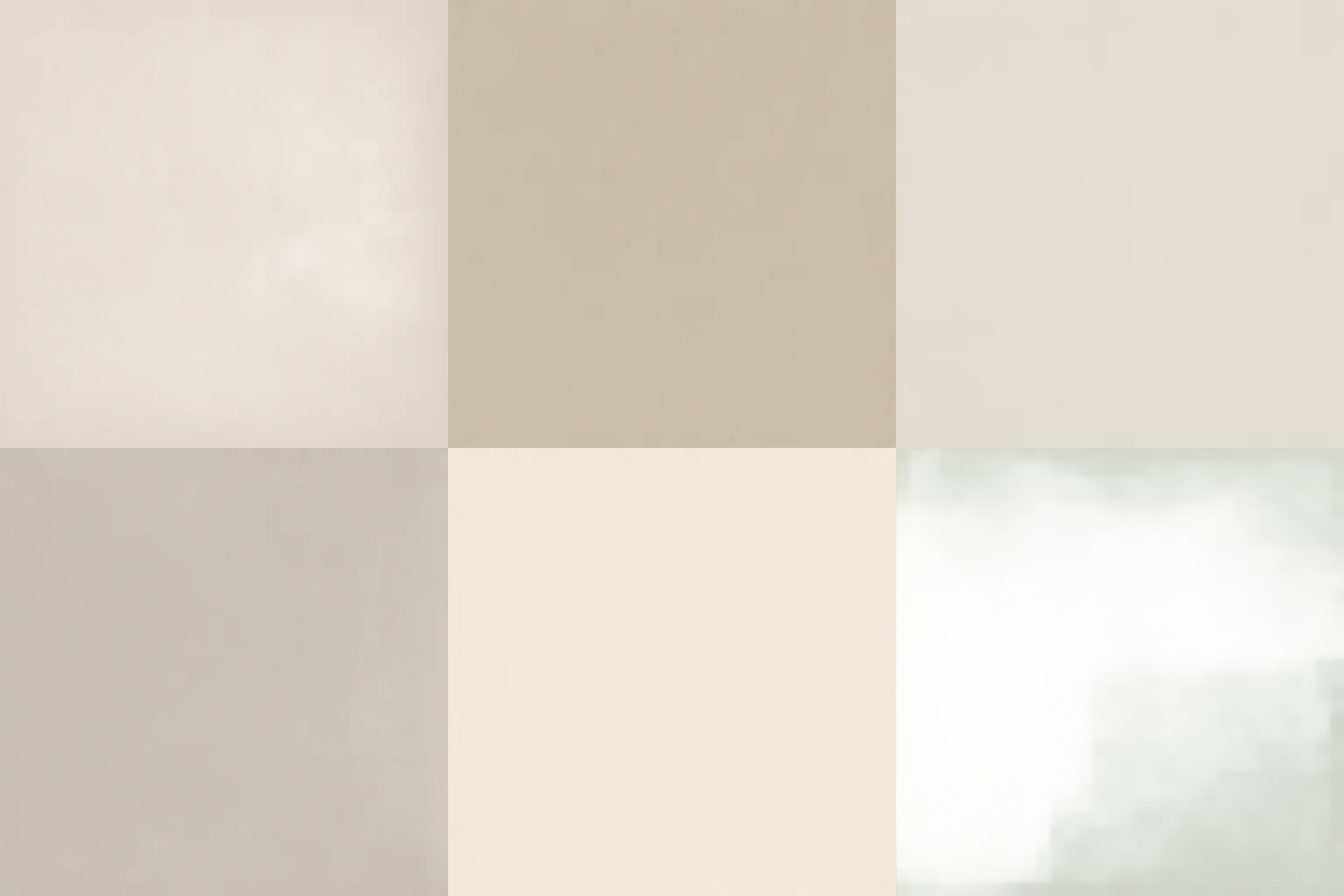
The hex value names the ground color beneath the surface detail. It is useful as a reliable reference in a design file, but it does not mean every pixel in the texture has that exact color: fibers and tonal variation shift the appearance around it. The two linen cues are warm and restrained, the plaster pair moves from chalk to greige, and the paper pair stays light enough for a range of layouts.
- Flax Linen
#E8E0D2 - Oat Linen
#D2C4AD - Chalk Plaster
#E6E1D7 - Soft Greige Plaster
#CFC8BC - Ivory Handmade Paper
#F1E9D7 - Pale Sage Rag Paper
#DCE1D6
In plain text, the six base codes are Flax Linen #E8E0D2, Oat Linen #D2C4AD, Chalk Plaster #E6E1D7, Soft Greige Plaster #CFC8BC, Ivory Handmade Paper #F1E9D7 and Pale Sage Rag Paper #DCE1D6. Copy a code into a color field when you need to match a border, label or solid block to the background. For print, use the code as a starting point and proof the result on the paper and printer you plan to use; a screen color value alone cannot guarantee a particular printed appearance.
Match the surface to the job
Choose by scale and contrast, not just by the name of the surface. A delicate texture works behind information that needs to be read quickly; a more visible grain can be useful where the background itself is part of the composition. Start with the intended use, then test the image at the size it will actually appear.
- Flax Linen #E8E0D2: use behind a blog header, a short title or a pale mood-board label. Its fine crossing lines add a little structure while keeping the overall field light.
- Oat Linen #D2C4AD: try it on an invitation or a photo-overlay panel where a warmer ground can separate a caption from the image. Keep text away from the most visible thread-like marks.
- Chalk Plaster #E6E1D7: use for a clean, quiet background in a mood board or a long page section. Its cloudy variation reads more softly than a completely flat fill.
- Soft Greige Plaster #CFC8BC: reserve it for short, high-contrast text, a frame around a photograph or a small graphic panel. Its deeper ground needs a deliberate text-color check.
- Ivory Handmade Paper #F1E9D7: use for invitations, announcement cards or blog sections with compact copy. The faint flecks suggest paper without turning into a prominent pattern.
- Pale Sage Rag Paper #DCE1D6: use as a secondary mood-board surface or a calm photo-overlay strip. Pair it with a dark neutral for labels rather than relying on a low-contrast pale shade.
For a photo overlay, place a solid or lightly textured panel behind the words instead of setting text directly over a detailed part of the photograph. For an invitation, keep the names and essential details on the quietest area. On a mood board, use one texture as the main ground and another only as a small swatch; using several visible grains at once can make the board feel noisy.
Keep text readable over the grain
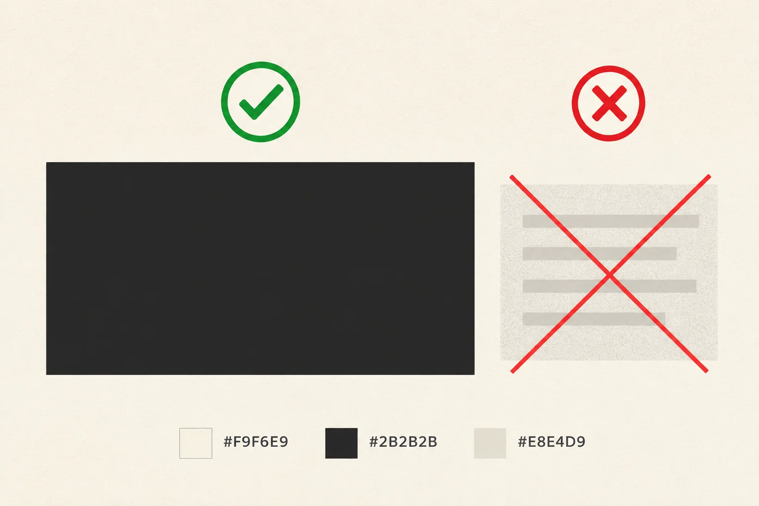
Texture reduces the predictability of the background, so a color pairing that looks clear on a flat swatch may be harder to read on the finished image. Check the actual text over the actual texture at its intended size. The UK Government’s WCAG Explorer gives a useful contrast reference: the WCAG AA target for ordinary-sized text is a contrast ratio of at least 4.5:1; large text has a lower 3:1 target. These are contrast checks, not a substitute for inspecting the layout.
- Use a solid text panel, or a very lightly opaque one, when the grain passes behind small type.
- Keep text well away from high-variation marks. A clear area around each line is more dependable than a thin outline or drop shadow.
- Check the smallest text first, including captions and invitation details. If it is difficult to read at the intended display size, darken the type, lighten the panel or make the panel more opaque.
- Preview the design in grayscale as a quick check that text and background remain distinct, then check it again in color.
A dark charcoal or deep brown is often a practical first test on the lighter grounds, while the greige texture may need white or a pale cream. Do not assume that a color name guarantees sufficient contrast: the texture detail changes the surface, and adjacent colors with similar lightness can blur together. The UK Government Design System’s image guidance is also a useful reminder to give meaningful images an appropriate text alternative; describe what a particular texture shows rather than calling it simply “background.”
Download, crop and prepare a file
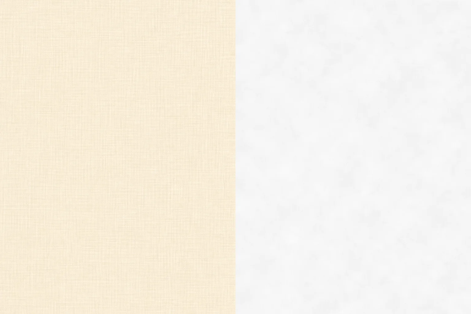
The three download sheets below each contain two generated texture panels. Crop at the straight join to separate the pair, then save the panel you want as its own background. The first sheet pairs the linen colors, the second pairs the plaster colors, and the third pairs the paper colors. No lettering, mock room, photographed surface or decorative frame is baked into the panels, so the crop can be used as a background rather than as a finished poster.
For screen use, keep an sRGB copy and crop to the shape of your destination: a wide banner, a square post or a vertical invitation. Preserve a little extra image around the text area so you can reposition the crop without stretching the texture. Avoid enlarging a small crop beyond its useful resolution; if it looks soft at the final display size, return to the largest original file rather than sharpening it aggressively.
For a print-ready working file, a practical target is 2400 × 1600 pixels for a single landscape panel. At 300 pixels per inch, that is about 20.3 × 13.5 cm (8 × 5.3 in). This is a preparation recommendation, not a promise that every printer or paper will reproduce the same color. Keep a copy of the original sheet, crop a duplicate, and make a small proof on the intended stock before preparing a full run. A texture is most useful when it supports the content; if its fibers or mottling become the first thing you notice, reduce its visibility or choose a quieter surface.
- Download the sheet that contains the texture pair you want.
- Crop one panel along the dividing edge; do not stretch it to fill a different shape.
- Save a working copy in the format required by your design or print workflow.
- Add text and images, then check contrast at the final display or print size.
- Keep the original sheet so you can make a new crop if the layout changes.
Download the files
Free for personal and commercial use. These files are generated artwork, not photographs.
Questions
- Can I use these textures as repeating tiles?
- They are designed as backgrounds and crops, not guaranteed seamless tiles. To make a repeat, inspect all four edges and test a tiled preview before using it in a pattern.
- Will the base hex code match the whole texture?
- No. The hex value identifies the ground color; the generated grain and tonal variation create pixels that are lighter or darker. Use the code as a color reference, not a color measurement for every point in the image.
- Which texture is best behind small text?
- Start with Chalk Plaster #E6E1D7 or Ivory Handmade Paper #F1E9D7, then test the actual type and contrast. If the surface detail interferes, place a solid panel behind the text.
- Can I print a screen background?
- Yes, but proof it first. Crop a sufficiently large file, prepare it for the print dimensions and check the result on the intended paper, since screen color values do not guarantee a particular printed appearance.