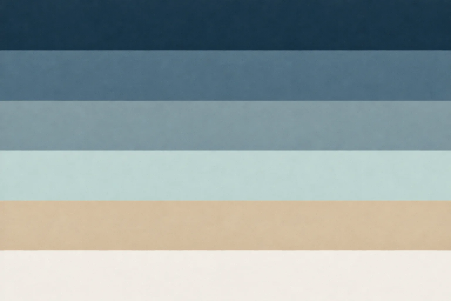
Coastal Blues: A Balanced Palette from Navy to Sea-Glass
Published
Balance coastal blues by giving one shade the largest area, using one or two mid-tones for support, and reserving pale sea-glass for light accents. Pair the blues with warm sand and soft white so the range feels grounded rather than nautical. This palette moves from deep navy through denim and slate to sea-glass, with hex codes for design tools and practical guidance for rooms, digital work, and changing daylight.
A blue range with room to breathe
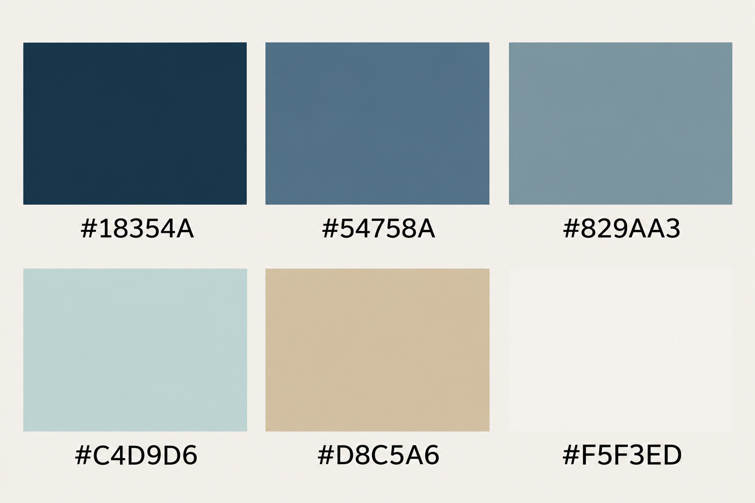
The palette works because its colors share a blue foundation but vary in depth and temperature. Navy gives the range a visual anchor; denim feels softened and familiar; slate brings a quiet gray note; sea-glass supplies the brightest, least saturated blue. Sand adds a warm counterweight, while white leaves space between the stronger colors. The result is coastal in its reference to water and weathered stone, without depending on anchors, stripes, or other literal motifs.
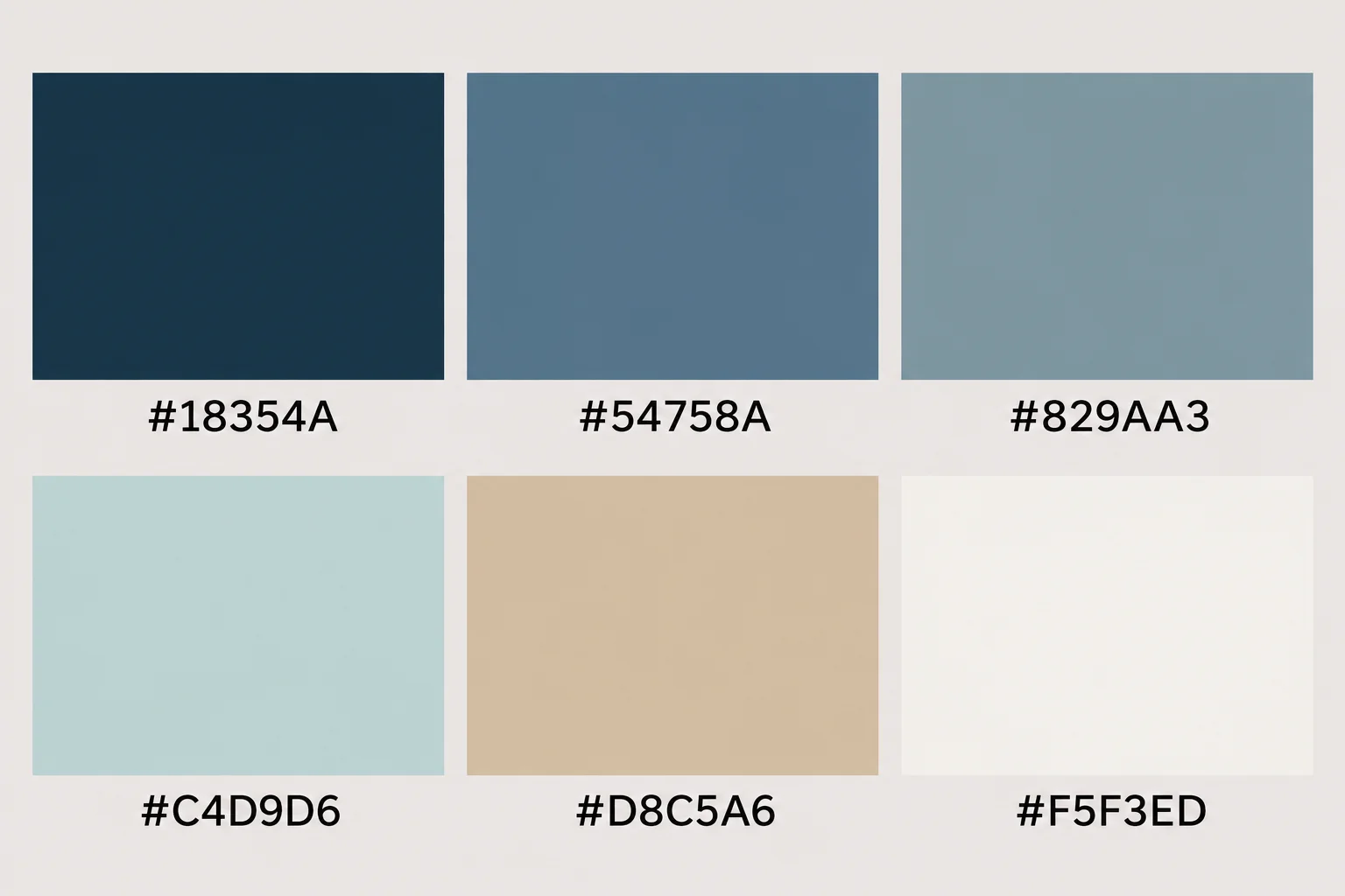
- Deep Harbor Navy
#18354A - Worn Denim
#54758A - Tidal Slate
#829AA3 - Pale Sea-Glass
#C4D9D6 - Dune Sand
#D8C5A6 - Soft Chalk White
#F5F3ED
Keep the order in mind when applying the colors: #18354A is the deepest note, #54758A is the adaptable middle blue, #829AA3 is the muted bridge, and #C4D9D6 is the light accent. #D8C5A6 warms the set; #F5F3ED is a gentler alternative to stark digital white. Hex values are starting points, not promises that a screen, printer, or paint mix will match exactly.
- Use navy in small, deliberate areas: a title band, a narrow trim detail, or a single piece of furniture.
- Let denim or slate carry the middle of the composition; they connect the deep and pale blues without a sharp jump.
- Use sea-glass and soft white for breathing room, then add sand where the palette needs warmth.
A useful first layout is 10% navy, 25% denim and slate together, 25% sea-glass, and 40% sand and white. Treat those figures as a composition guide, not a formula: a small room may need less navy, while a graphic with a white field can use more blue. Adjust one color at a time so you can see which change improves the balance.
Where each shade earns its place in a room
In a room, match color depth to the surface and its visual weight. Navy can define a compact area, such as the inside of a bookcase or a small entry wall, but a broad dark wall will have more presence than a swatch. Test it on a movable board at least 30 × 45 cm (12 × 18 in), and view the board beside the floor, trim, and upholstery before committing. This keeps the decision tied to the materials that will stay in the room.
Denim is a flexible choice for larger painted areas, cushions, or a fabric headboard; slate sits comfortably beside pale wood, stone, and natural linen. Sea-glass is most useful where you want a light blue impression without making the whole scheme feel cool. Use sand on woven materials, a rug, or a wood finish rather than adding another saturated color. Keep white on trim, ceilings, or larger textiles to create a clear pause around the blues.
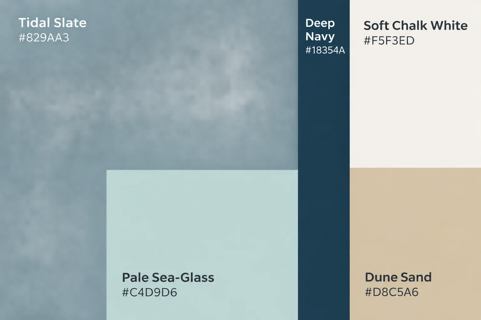
For a simple room proportion, begin with one main blue, one lighter blue, and the two neutrals. For example, use slate as the largest blue surface, sea-glass in a smaller textile, and navy in a narrow accent. Put sand close to the blue rather than isolating it at the far end of the room; nearby warm and cool colors make their relationship easier to read. If the room already has strongly patterned fabric, choose the quieter colors from the palette for new surfaces.
Read the light before choosing a paint match
Blue changes character with the direction and strength of the light. Benjamin Moore's guidance for north-facing rooms and south-facing rooms, along with Sherwin-Williams' room-orientation guidance, treats exposure as a useful part of paint selection. As a practical starting point, north-facing light often makes cool colors feel cooler or more muted; strong south-facing light can make a blue appear brighter and warmer. The actual effect also depends on the window, surrounding surfaces, and time of day.
To test a paint interpretation, put two or three samples on separate boards rather than comparing tiny chips in a store. Make each board at least 30 × 45 cm (12 × 18 in), and paint two coats if the paint instructions call for it. Move the boards between the wall that gets the most light and a more shaded wall. Check them in morning, midday, and evening conditions, then compare them with the room's white trim and sand-colored materials.
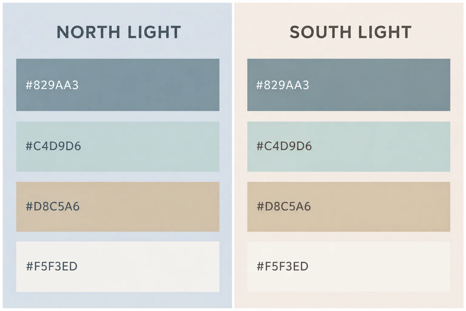
In a north-facing room, try a slightly grayer slate or a warmer sand nearby if the blue feels chilly. In a bright south-facing room, inspect pale sea-glass for an unexpectedly vivid or washed-out look; the strongest light can change the apparent balance. Do not assume that a screen hex code identifies a paint color. Use the hex as a visual brief, then test physical paint samples in the actual room before selecting a finish.
Use the same palette in digital layouts
For a blog header, invitation, or mood board, use navy for a title or small information panel, and reserve sea-glass for a larger background or a broad margin. Sand can soften a white page, while slate works for secondary text panels or image captions. Keep the deepest blue away from small, low-contrast text on a similarly dark surface. For essential text, use a clear light-on-dark or dark-on-light pairing and check it at the size people will actually read.
A digital background should support its content, not compete with it. Begin with a flat sea-glass or soft-white field, then introduce a restrained texture such as a faint paper grain or a blurred, low-contrast band of slate. Avoid placing busy texture directly behind small lettering. If you are sampling colors from an existing reference image, Adobe's Color Palette Generator can extract a palette from an image; compare those sampled values with this set and adjust them to suit the intended use.

Screens emit light, while printed paper reflects it, so the same numerical color can appear different across devices and output. For a print invitation, export a small proof and inspect it under the light where it will be read. For a website or social graphic, preview the design on more than one screen if possible. Keep the hex codes in the source file, but treat the proof as the final check for the specific screen or paper.
Download the swatches and background
The downloadable swatch sheet is a clean reference for the six colors above. It uses flat color fields and plain-text hex labels, with no room photography or decorative nautical icons. A companion background uses a subtle, generated sea-glass-to-slate wash with a fine paper-like grain, leaving a broad quiet area for text or a photograph. Both files are generated graphics rather than photographs of real interiors.
Use the swatch sheet to copy colors into a design tool or to show a paint counter the visual direction you want matched. The background is sized at 3000 × 2000 pixels; at 300 pixels per inch it prints at about 25.4 × 16.9 cm (10 × 6.7 in). For larger print work, scale it only after checking that the texture remains clean at the intended size. The colors are reference values, so a print proof is still important.
To build a room board from the files, place a photograph or material sample next to the swatch sheet and compare the blue against actual flooring, fabric, or paint. To build a digital header, use the background at its native dimensions, add a clear text area, and check the smallest text at mobile size. In either case, keep sand and white visible in the final arrangement; they prevent a run of blues from becoming one uninterrupted cool field.
Download the files
Free for personal and commercial use. These files are generated artwork, not photographs.

Questions
- Can I use these hex codes to order paint directly?
- Use the codes as a visual reference, not as a guaranteed paint formula. Ask for a physical match and test a sample in the room, since screens and paint surfaces can show color differently.
- Which blue is the safest choice for a large area?
- Denim or slate is usually easier to distribute across a larger area than navy. Check a large sample board in the room first, because its daylight and nearby materials affect how the color reads.
- How do I keep a blue invitation from feeling cold?
- Use sand or soft white as a substantial background or margin, and limit navy to headings or small panels. A small amount of warmth can balance a larger field of blue.
- Can the background be used behind text?
- Yes, but place text over the quietest, lowest-contrast part of the background. Check legibility at the final display size, and add a solid pale or dark text panel if the grain interferes.